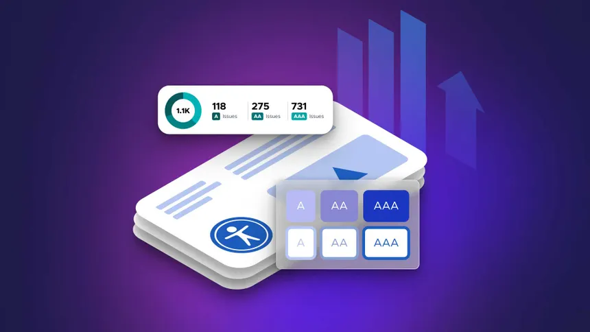

| Most all of my projects follow basic design guidelines from WCAG, which covers a lot of issues for all users. Clear text, correct contrast, etc. is key; the interface should not compete with the task flow or the feedback from the system. You will notice in my portfolio that containers/components are modular/expandable/scalable, they are meant to be grouped, change and guide – not to simply decorate. Text and data output should be primary, CTAs are next.
I approach interfaces like tools – at their core apps should prioritize utility that’s delightful in its efficacy and ease, because we have validated our design hypotheses and confirmed usability heuristics have been satisfied. I follow a standard hierarchy of visual elements – and within the constraints of best practices we can innovate and get real Zen – working within a framework, there is a surprising amount of freedom to be creative. |
The tricky parts are covered by standardized heuristics. I’m establishing some industry standards – we need them. We don’t want to innovate ourselves into bad usability or rely too heavily on support docs. No training manuals please on how to use an app – even an infotip is pushing it for me.
A good designer builds trust with users by not jerking them around on the site (meaning lots of clicking, squinting and mystery meat). I prefer to engage developers with well researched concise solutions user want, asking them to call APIs and automate as much as possible, so the user is not having to do the work that development teams can easily implement. In return, I’ll verify that we are building the correct application in the most efficient way.
|
Click to enlarge.